At university, I was given the task of designing a new logo for a fictitious company. The basic requirements were the following:
- Name: Stellar Studios
- Founded: 2017 by three students
- Field of activity: Production of image and advertising films
- Zielgruppe: Selbstständige kleinere bis mittelständige Unternehmen
- Principle: High quality at affordable costs for the customer
Customer requests for the logo:
- Representation of the founding members
- Inclusion of star(s) due to the name “Stellar Studios”
- Recognizability as a film studio
- Experimental, modern and dynamic design
After receiving the brief, I began using various methods to generate ideas, including semantic differential, automatic writing, keywords, mood boards, style boards, grid drawings, etc.
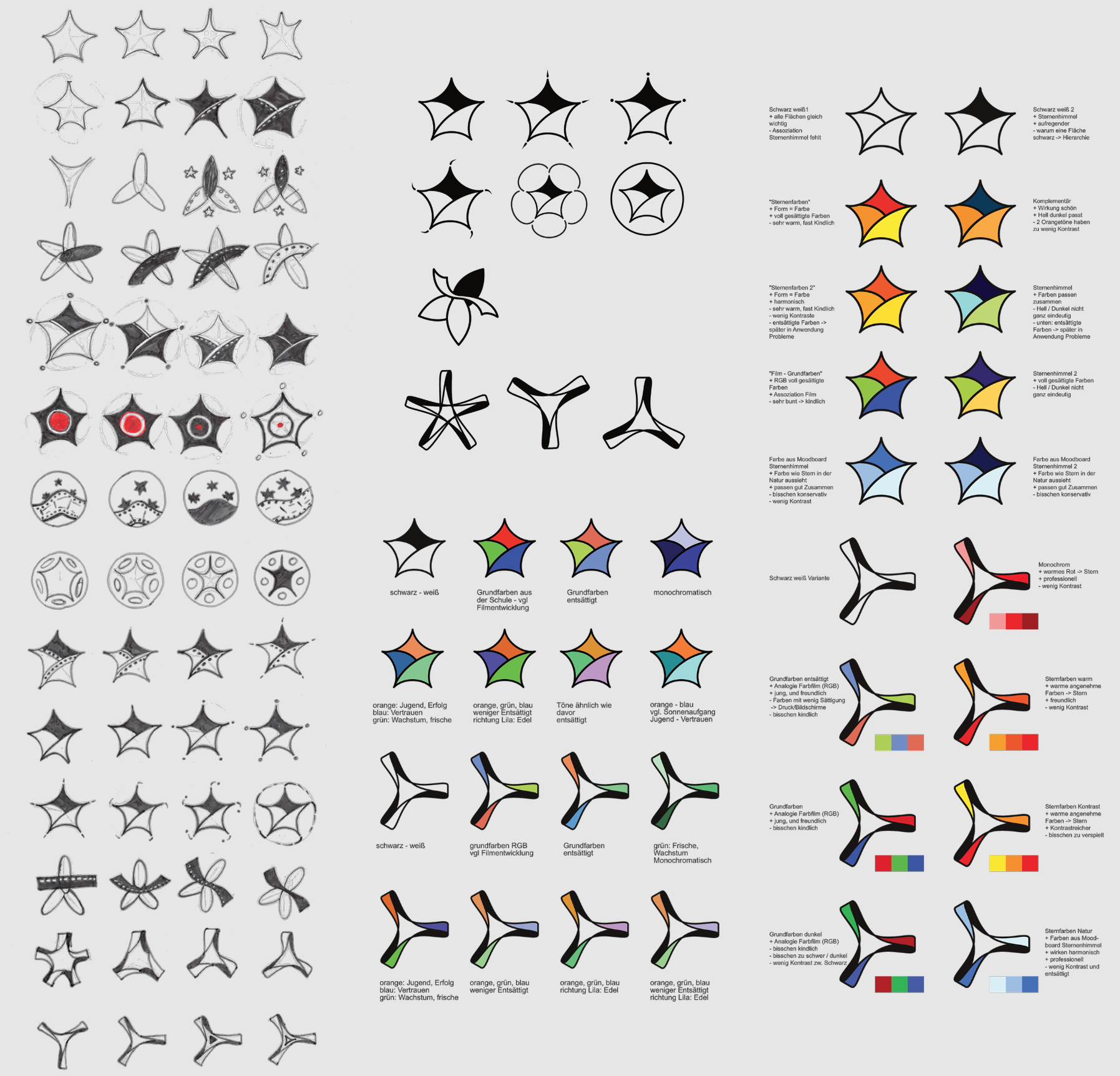
During the process, I held "client meetings" with fellow students and continued to iterate on the black and white versions of the logos. I then decided on two favourites and continued to work with different colour schemes (see below). The challenge was that the logo had to be young and dynamic as well as contrasting enough to be barrier-free and clearly recognisable even in miniature form.
The finished logo consists of a star-shaped film tape as a tribute to the analogue film era. To give it a modern touch, the film tape is designed in the colours red, green and blue, as would be the case with a modern colour film (in RGB colours). I attached particular importance to a dynamic arrangement of the film reel and to the fact that it consists of three spikes, which are intended to remind us of the three founding members.

